My Role
UX Designer
Project Lead
Tools
Figma
Lucidchart
DURATION
4 iterations over 6 months
Design, test & learn
THE TEAM
1 UX Researcher
1 Project Coordinator
1 UI designer
MY KEY CONTRIBUTIONS
Project Management
Concept Ideation
Prototyping
Mockups
Copy Writing
Context
Ubisoft+ Subscription
The subscription offer Ubisoft+ has been launched in September 2019 and give access to a catalog of 100+ Ubisoft games for 14,99€/month. Its awareness is lower than others gaming subscriptions so one pillar we need to work on is its integration within our channels.
In terms of flows, the GAME page remains the entry door that bring users to the Ubisoft+ interface. Our presence on those pages is crucial as well as the way we promote the subscription. This case study will focus on the e-commerce game page of Assassin’s Creed Valhalla.
Challenge
Subscription vs Purchase
How should we display subscription offer vs purchase offer on an e-commerce game page to maximise revenues and increase Ubisoft+ acquisition?
There is no specific guideline or strategy defined from business when we started. As a UX lead, I had the objective to find the right layout based on tangible elements to convince top management it is the best option for conversion as well as for the users.
Initial UX
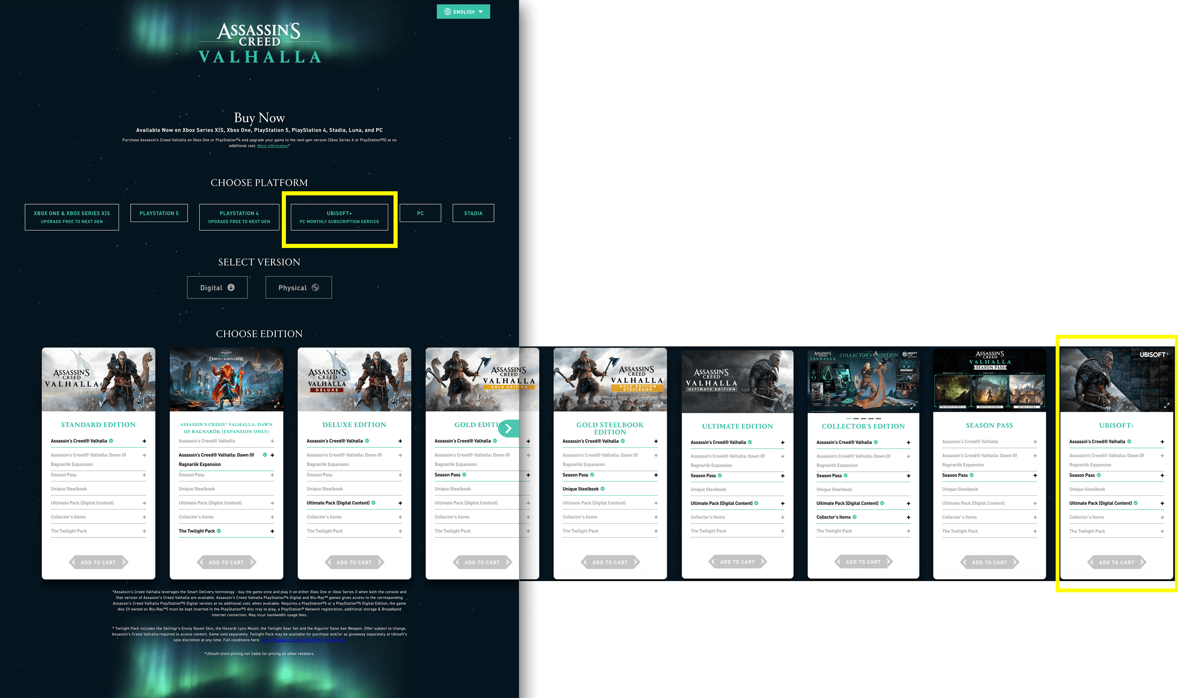
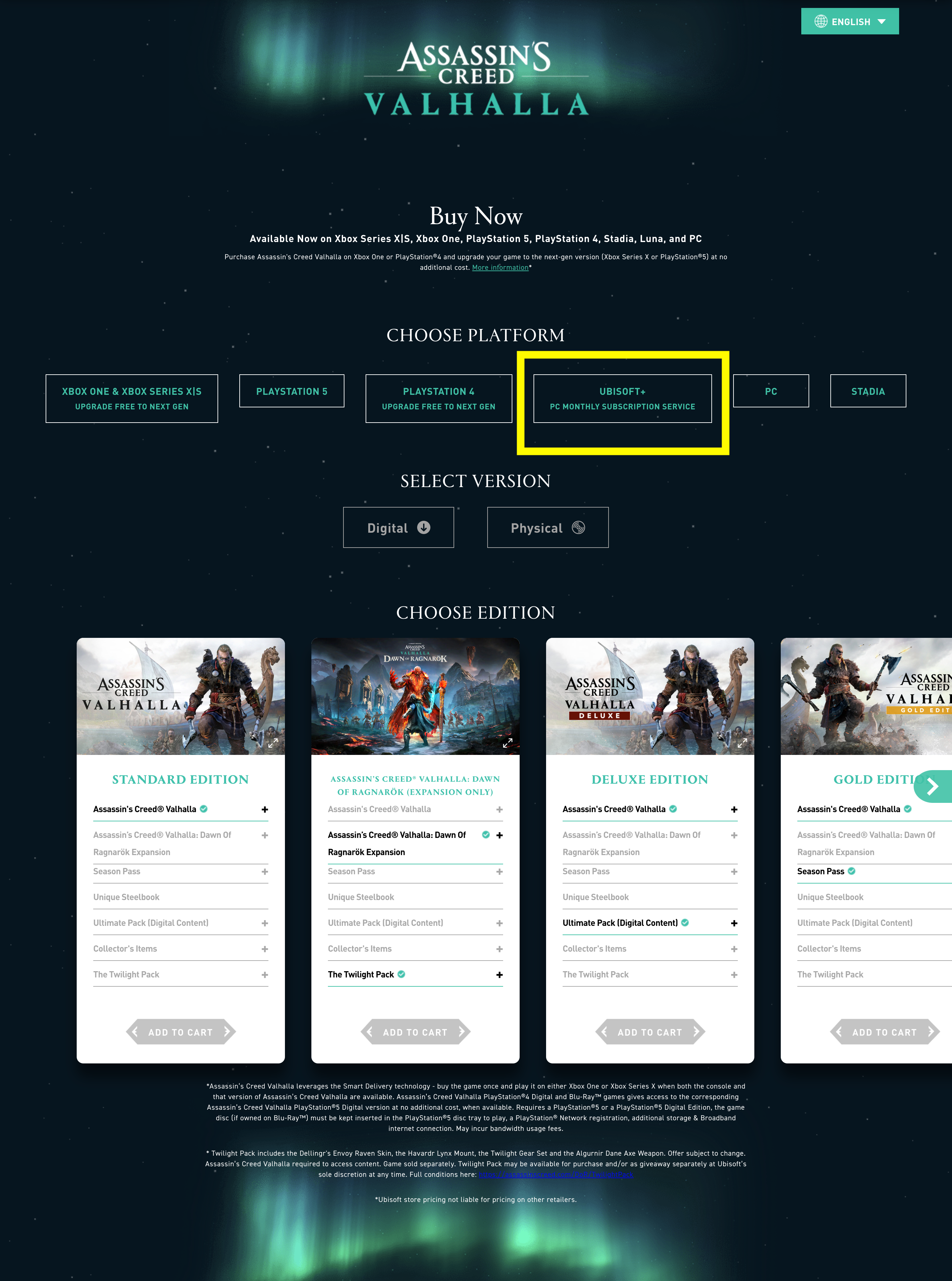
At the start of the project, the Ubisoft+ offer was only presented on the Assassin’s Creed Valhalla United States brand site. Here’s how it was integrated alongside purchase options:
Ubisoft+ presented as a platform option
Ubisoft+ last tile as an edition option (need 5 clicks on the slider's arrow to be visible)
DESIGN THINKING
The process I followed

Step #1, 2
Research & Define
- Offer clarity issues: The initial UX presented Ubisoft+ as a platform and an edition which is not relevant with its nature. Ubisoft+ is a subscription service, the editions included are the premium ones and the platform is PC.
- Competitor strategy: Subscription is prioritized over the purchase option. They strongly influence the consumer to choose to subscribe
- Business point of view: There is no initial desire to highlight one more than the other.
- Data analysis: The click-through rate on the platform option is low and that of the editions is less than 1%. The conversion rate for Ubisoft+ is very low and the traffic is not qualified. The visibility on the offer is bad that may explain those results.
Step #3
My vision
- Stay user centric: It’s a project with a strong marketing stake, as UX I have to carry the voice of the user and since there is no established business guidelines I adopted a different position from the competition.
- Do not influence user’s choice: Which means that I didn’t want to influence the user’s choice towards purchase or subscription although I am UX for the subscription offer. So I explored design options where both offers were displayed at the same level
- Bring more clarity: Ubisoft+ has a low awareness so bringing more details to understand the service is crucial. Such as the key features and advantages.
Design exploration
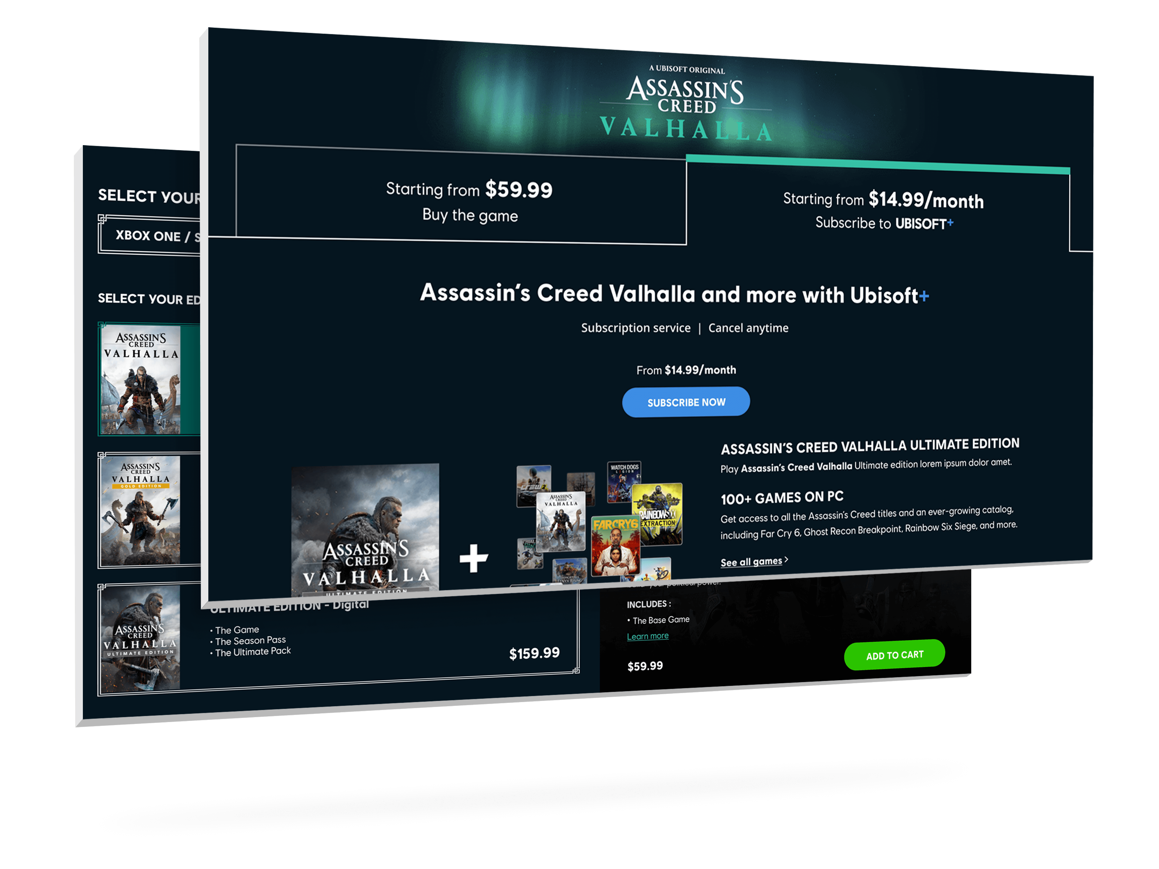
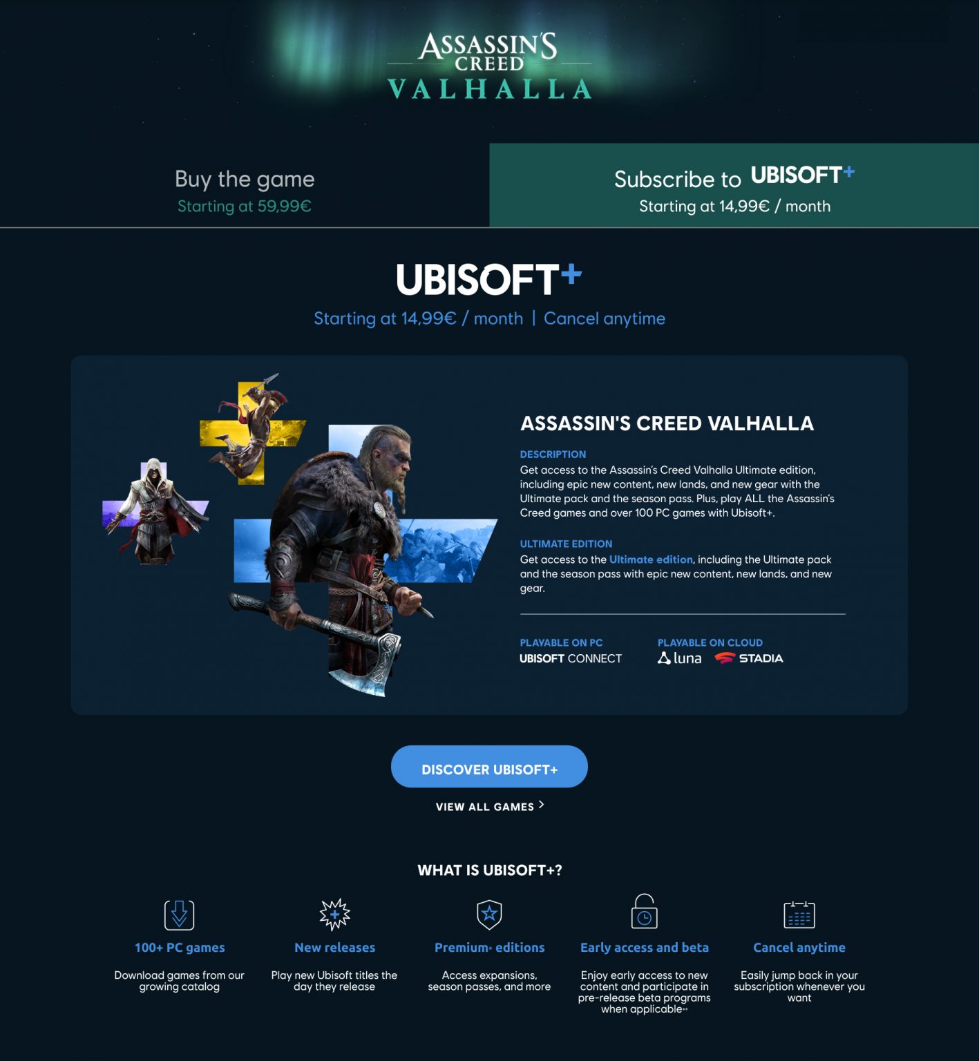
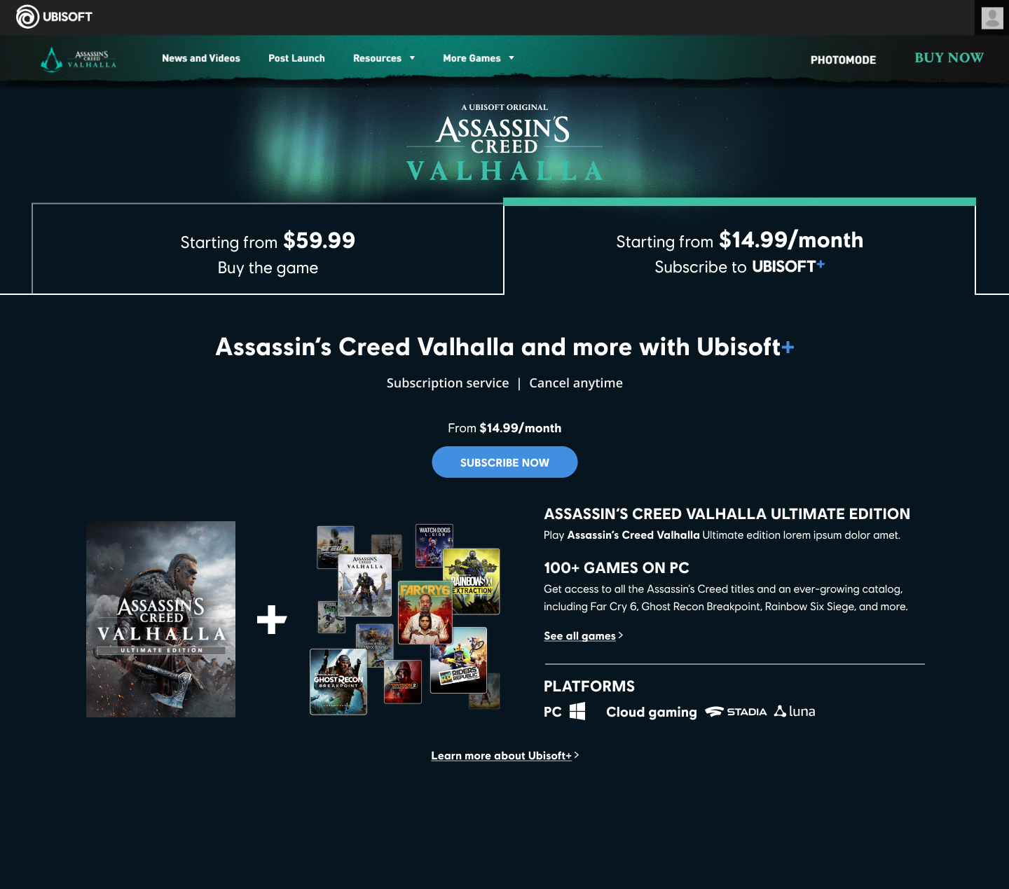
The subscription being an alternative to buying the game, I removed Ubisoft+ from the purchase module in order to create a system of tabs with the starting prices. No change for the “Buy” tab that was out of scope at the moment. Key benefits:
It gives us the space needed to describe Ubisoft+ within the second tab
It offers more visibility to the subscription right at the top of the page
Step #4, 5
User Testing
Key learnings live XP no tabs:
When Ubisoft+ presented as a platform: Most won't talk about Ubisoft+ if we don't ask them, don't seem to notice it on their own
Most participants don't understand what edition is included in Ubisoft+ : when asked, some rather expect to have Standard edition
Key learnings new prototype with tabs:
Users understood Ubisoft+ is a subscription service and what editions are included
A few participants expressed their satisfaction to have these information on the same page
The layout with tabs: (9/9) ALL participants can understand what is Ubisoft+ in comparison with "BUY"
However not all of them have seen the tabs as clickable before guidance from interviewer
Some participants don't get U+ includes many Ubisoft games + A few participants wondered it the subscription was not on the game only
ITERATIONS
Other options have been tested
Option #1 First prototype displayed above : Tabs approach
Option #2 Tabs approach -> Ubisoft+ content changes
Option #3 Same Ubisoft+ bloc but below purchase module. No tabs.
Users come here BECAUSE OF THEIR INTEREST for the game, Ubisoft+ is not perceived as an alternative because of its design and place: considered as a SPAM or an AD.
Option #4 Consistent with competitor strategy by having a Ubisoft+ space a the top of the page above the purchase module. No tabs.
Most participants felt this U+ section and its localization was invasive and irrelevant
("I feel forced", "It's like and ad")
A few participants wondered it the subscription was not on the game only
("So I pay a game every month ?!")
ITERATIONS
The solution
Decisions taken based on User Testing results:
Tabs: I made them more affordant to be perceived as clickable. I have also alternated the title and the subtitle because it is the price that attracts the consumer to click.
Texts rework: Bring reinsurance with the texts displayed with the objectives: show the link between Ubisoft+ and the game, detail the edition included and promote the catalog of 100+ games
Artwork: I used a simple way to show that Ubisoft+ includes the game + the catalog of over 100 Ubisoft games. This has been completely understood by users in the latest tests.
NEXT STEPS
Monitor performance
The solution above is currently under development. I will follow closely quantitative data after the launch in production to see how it performs and what adjustements can be done as continuous improvements.
I am quite confident with this new design as we have observed a lift of traffic and an increase of conversion rate with this UX for another game launch in October 2021.
THANKS FOR READING 😊

