Case Study 2
Subscription funnel
Revamp of the subscription checkout to sell the new Cloud Gaming offer
UX Design, UI Design, Desktop, User feedbacks, Continuous improvements, Roadmap feature
My Role
UX Designer
Project Lead
Tools
Figma
Miro
Lucidchart
DURATION
2 months
Started in March 2021
THE TEAM
1 Project Manager
1 Product Owner
1 UI designer
MY KEY CONTRIBUTIONS
Project Management
Use cases definition
Benchmark
Prototyping
Mockups
Copy Writing
Context
A new plan for Ubisoft+
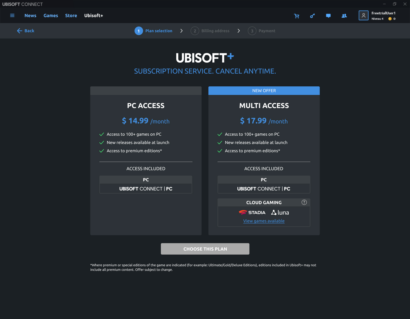
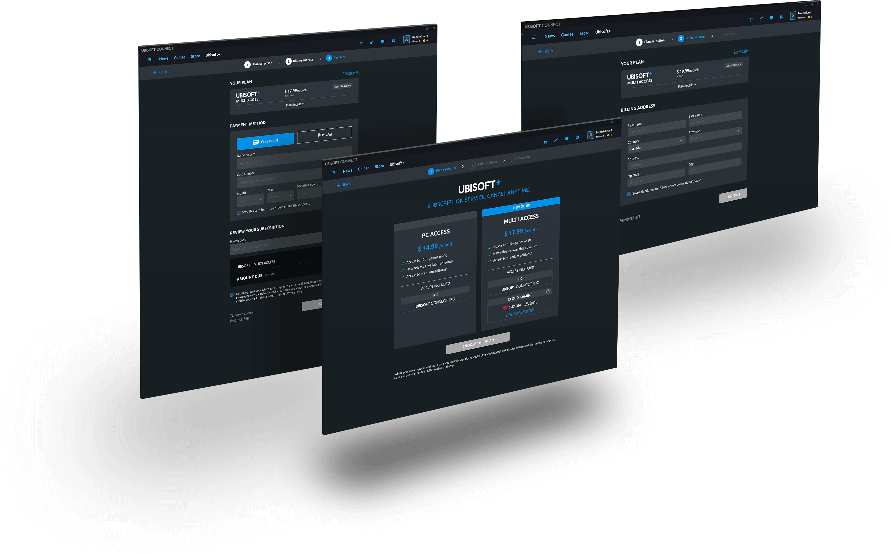
The subscription offer Ubisoft+ has been launched in September 2019 and give access to a catalog of 100+ Ubisoft games with an unique plan on PC for 14,99€/month.
In 2020 a partnership has started with Google Stadia and Amazon Luna to expand the platform offer to Cloud Gaming. This new plan is called “Multi Access” including PC and Cloud Gaming for a monthly rate of 17,99€/month.
Challenge
Checkout to be adapted
The transition from one offer to multi-offers has a lot of impact on subscription flows. Regarding checkout more specifically, the user must be able to choose between the two plans for example. The problem is that the checkout is the miror of the e-commerce checkout and has never been specifically tailored to subscription.
Step #1, 2
Research & Define
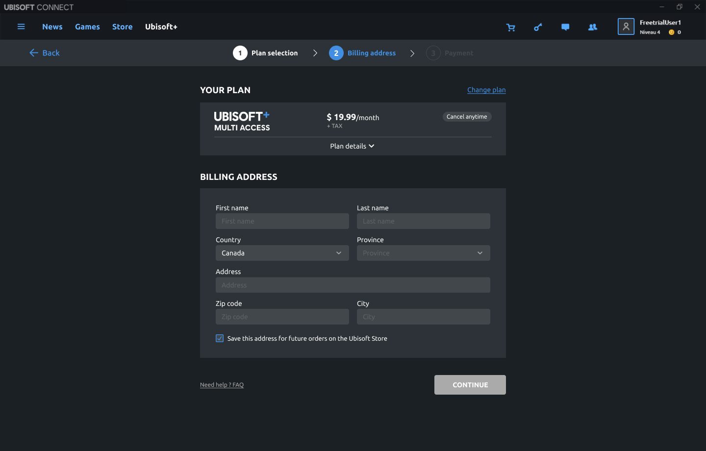
- Subscription industry benchmark: I observed for certains actors in the subscription industry that they have a funnel specifically designed for subscription with a plan summary section, some features like yearly plan etc. One important thing to keep in mind is the removal of any information that is not relevant in a subscription checkout and may affect the conversion. (Ex: Delivery information, cross-sell products…)
- Business strategy: The “Multi Access” will be the premium offer and needs to be highlighted over the “PC access” offer.
- Data / Feedbacks: We have received a lot of users’ complaints pointing out misleading information such as a 20% discount message displayed in the checkout however the discount is not applicable on Ubisoft+. Users also missed reinsurance regarding the engagement when subscribing, they want to know if they can cancel easily.
Step #3
My vision
Main problems I have identified with the initial UX:
High impact
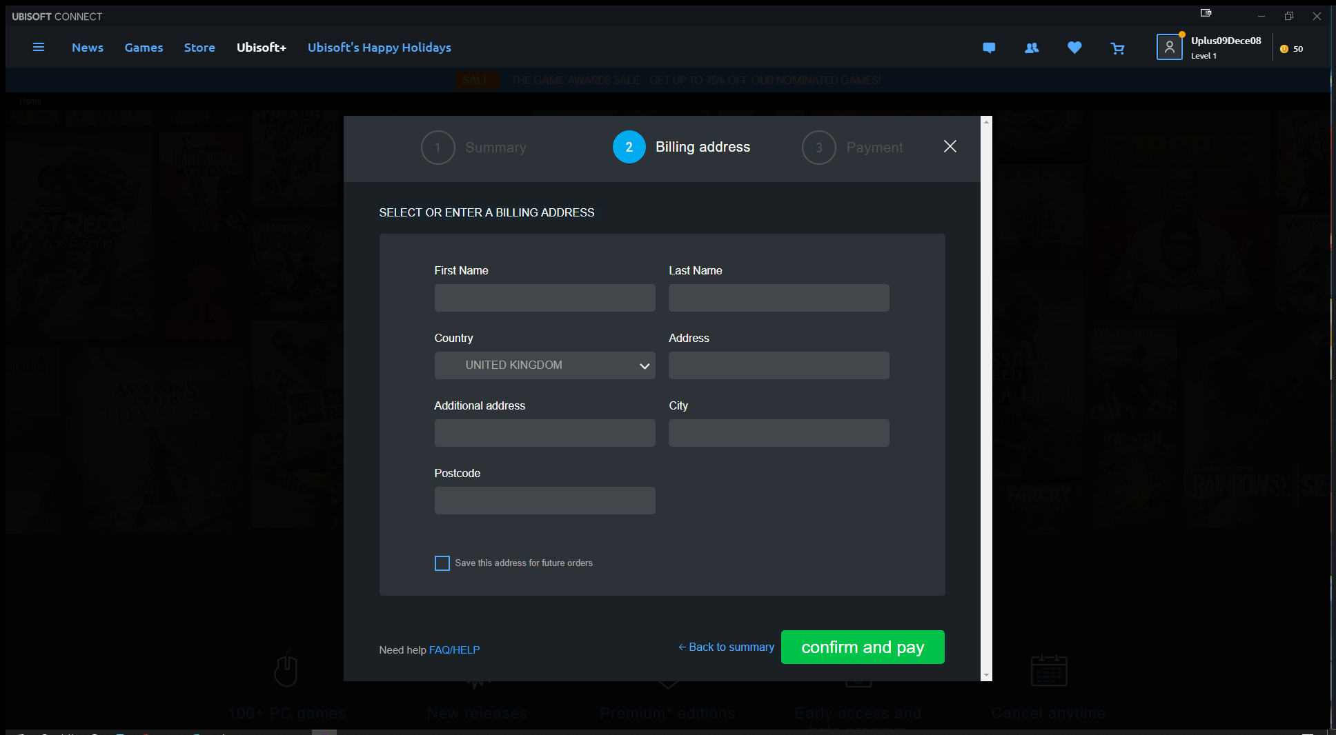
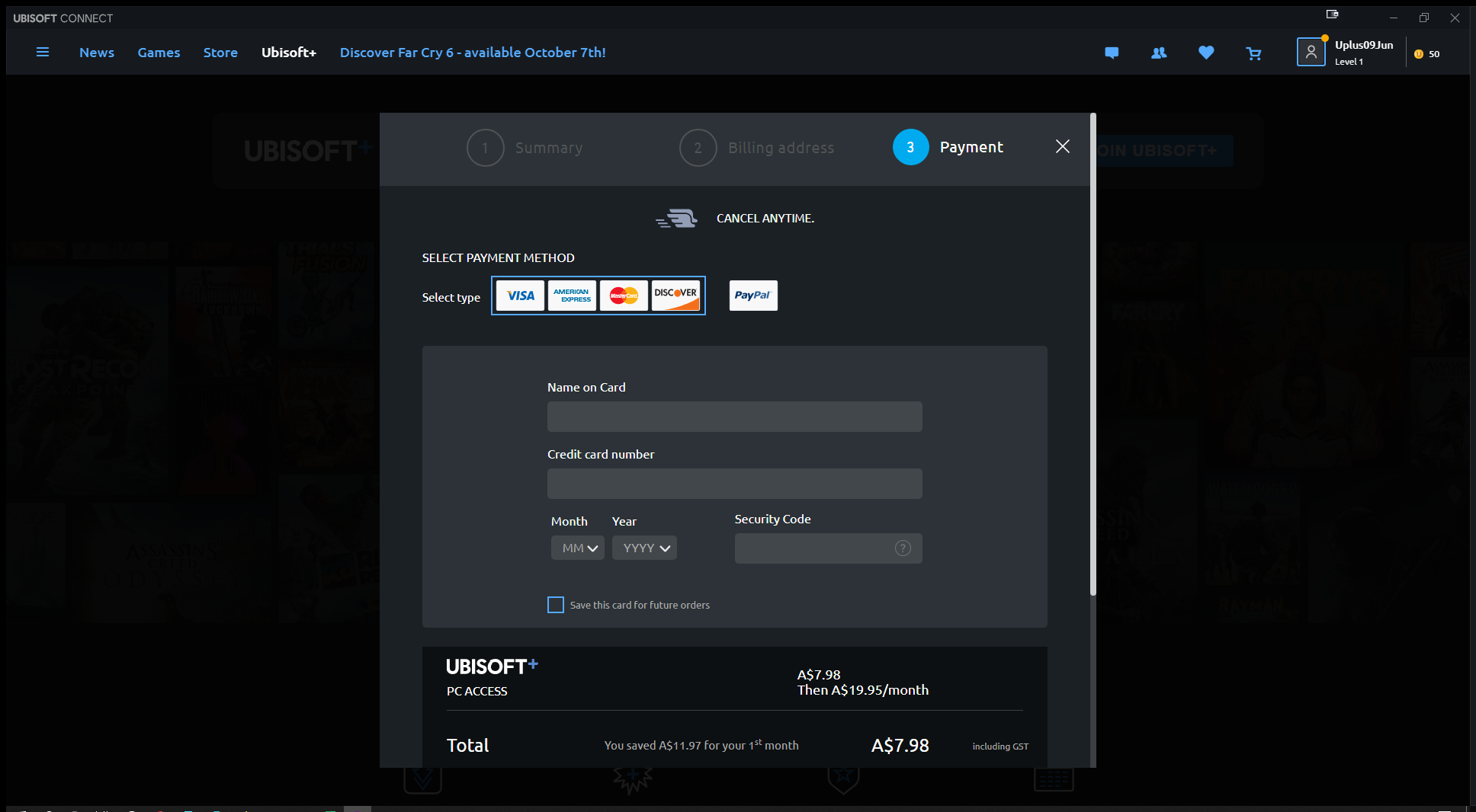
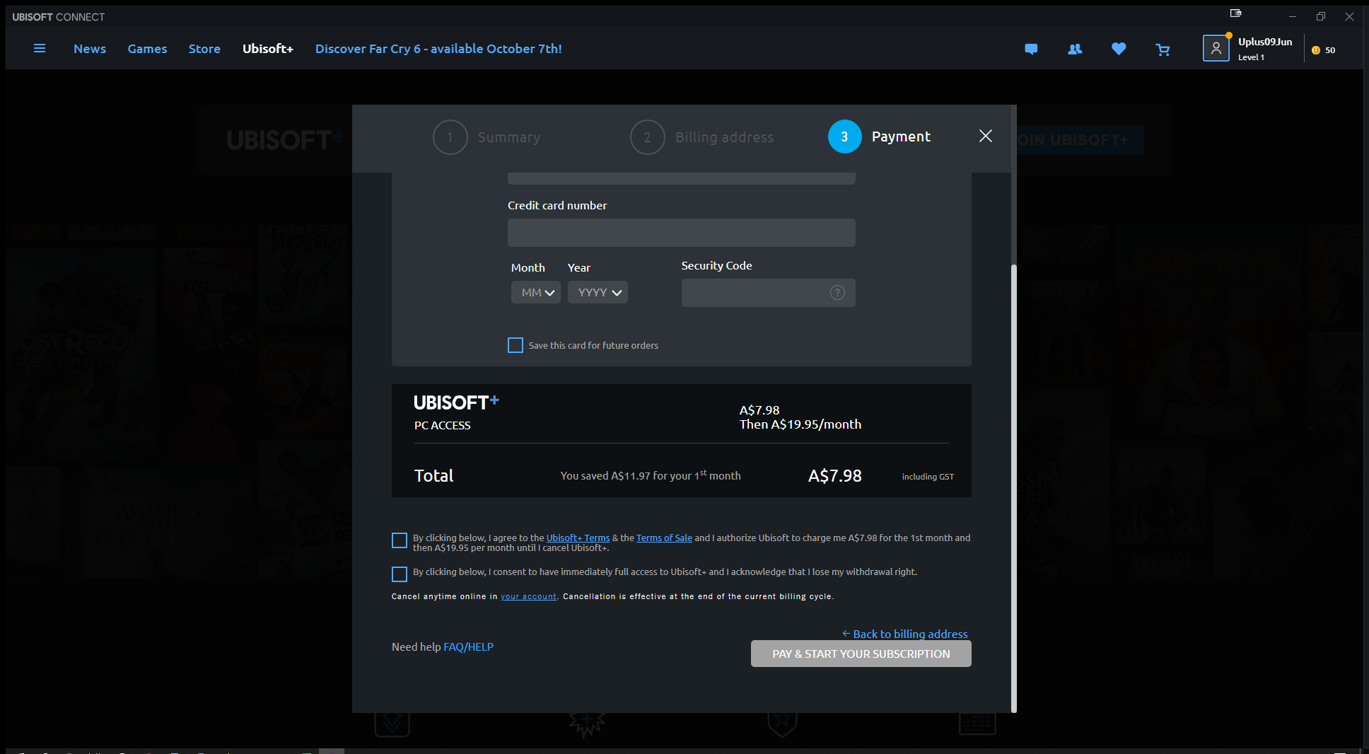
The funnel is built with pop-ups but it is meant to be a secure flow where we try to focus the user's attention on payment and remove any other distractions. There are many exit points available and the visibility of the information is poor due to the dimensions of the pop-up windows.
High impact
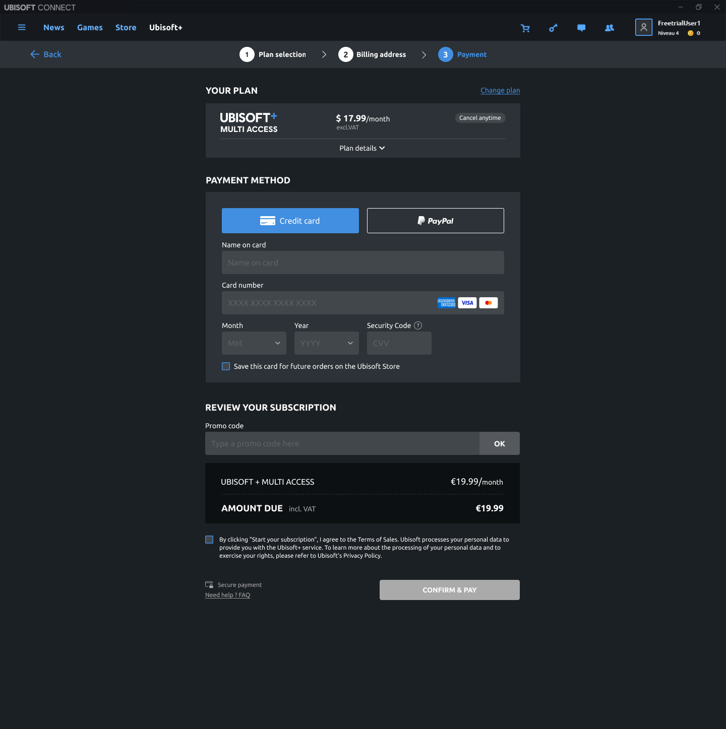
The payment method selection component is very confusing and unclear. There is no hover effect and the design does not show the user having to choose between credit card and paypal. This is a significant sticking point.
Medium impact
The user interface is not clean, there are a lot of spacing issues, font sizes are not consistent, the ratio of fields is not suitable for the information entered, etc. It doesn't provide a sense of "security" which is crucial for a funnel where payment information are entered.
Medium impact
There is not enough reassurance message in the funnel. "Cancel anytime" feature should be detailed, Ubisoft+ perks could be added.
Step #5
User Testing
Key learnings:
All participants completed the flow easily and quickly
Participants found the design minimalist and modern
They appreciated the reassurance regarding the plan and the clearly visible "cancel anytime" information
The asterisk linked to premium editions was perceived as a fear of hidden conditions by some users
The term "access" is not always well understood by users, which does not help the understanding of the concept of Cloud Gaming
NEXT STEPS
Continuous improvements
The negative points that follow the user tests are corrected post-launch as the impacts concern other Ubisoft+ flows. We have observed a decrease in negative comments in the survey which is permanently accessible in the checkout.
THANKS FOR READING 😊


